What’s this all about?

The year 2020 has seen the Covid-19 virus accelerate the trend of purchasing major items online as opposed to in-store. But spending a significant sum of money on a product sight-unseen is a bit uncomfortable at best, and downright nerve-wracking at worst. So people rely on product reviews to guide them.
I set out to discover exactly how people utilize and consume review content as part of the process of making a major purchase, and to find out if there were any opportunities to make the experience better.
User interviews
To start, I crafted a script and a list of open-ended questions and conducted interviews with five Seattle-area individuals to get a broad picture of how different people utilize review content. No surprise, there were behaviors that were specific to each individual, but there were also three significant takeaways from behaviors that all users shared.
People pay some attention to review content for just about every purchase online.
People pay significantly more attention to review content for high-dollar purchases, often (but not always) comparing user reviews and using a search engine to find ‘expert’ reviews.
Although people depend on reviews, they are universally suspicious of both user and expert reviews.
It’s this last point that jumped out as the biggest area of opportunity. People are suspicious of user reviews, wondering if they’ve simply been written by a product’s manufacturer, or if a person perhaps received a free product or gift in exchange for a favorable review. This latter suspicion also applies to ‘expert’ reviews, meaning reviews written by experts in the field or simply professional review writers.
This understanding of a universal pain point, along with the other findings from my interviews, allowed me to start to map out the journey users go through when they make a significant purchase online.
User journey
Although the idea is that users considering major purchases of all kinds will go through a similar journey, I’ve chosen to use the example of a television purchase for several reasons; it’s still likely to be a major expense for many people, it’s likely to be used for many years, and reviews on televisions are plentiful, both in terms of user-generated and expert-generated reviews.

Looking at the journey map, it’s easy to see opportunities for improvement. Not only does skepticism breed anxiety, but if a person wants to be as informed as possible, there’s a lot of website-hopping required. I wanted to explore solutions that would make people feel empowered, informed, and confident in their purchases online. So I had an idea of where I wanted to go, but first, I wanted to look at what’s already out there; what people are seeing and experiencing as they go through this process.
Competitive tear down and task flows
I looked most closely at Consumer Reports Best Buy to get an idea of how users are presented with review content, and how those sites worked in terms of navigation. I was able to latch on to some aspects of these sites I wanted to incorporate, such as approachable language and simple scoring, but also some that I wanted to improve upon, such as navigation.
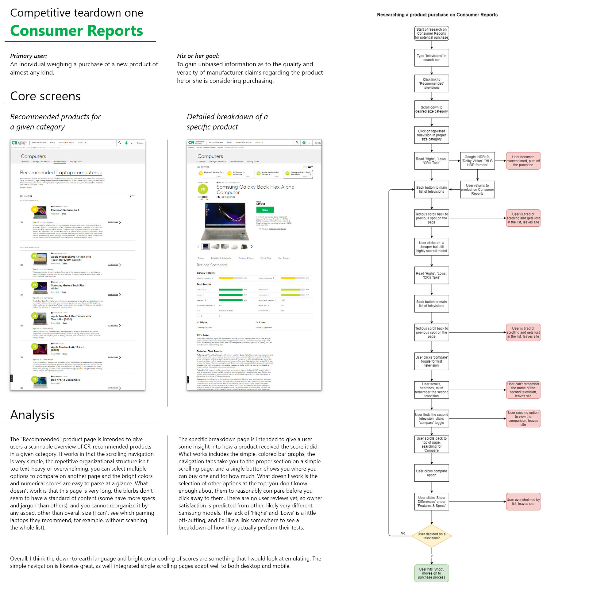
A competitive teardown of core screens, and a task flow for researching a product purchase on Consumer Reports.
Who Said What comes to life
Now that I had an idea of my goal (empowering and informing online shoppers) and how prominent sites present their review content, I was able to hone in on a solution: Who Said What.
Who Said What is a review aggregator. It crawls the web and finds user reviews and expert reviews from a variety of sites, averages their score and presents them in an accessible format so people can quickly get an idea of what the product is really like without having to hop from site to site on their own. As one of my classmates put it, it’s like Rotten Tomatoes but for major products instead of movies.

I then set about creating a task flow, seen above, which gave me insight into possible pain or failure points (a user exiting). It also helped me with some foundational ideas on what the basic navigation could be and some core functional needs of the app.
Sketching and wireframes
Now that I had a representative task flow for the core functions of Who Said What, it was time to put my cheap Bic pen to paper and make some sketches for how those screens would look to users. I utilized stencils and the basic design principles of contrast, repetition, alignment and proximity to optimally organize the information.
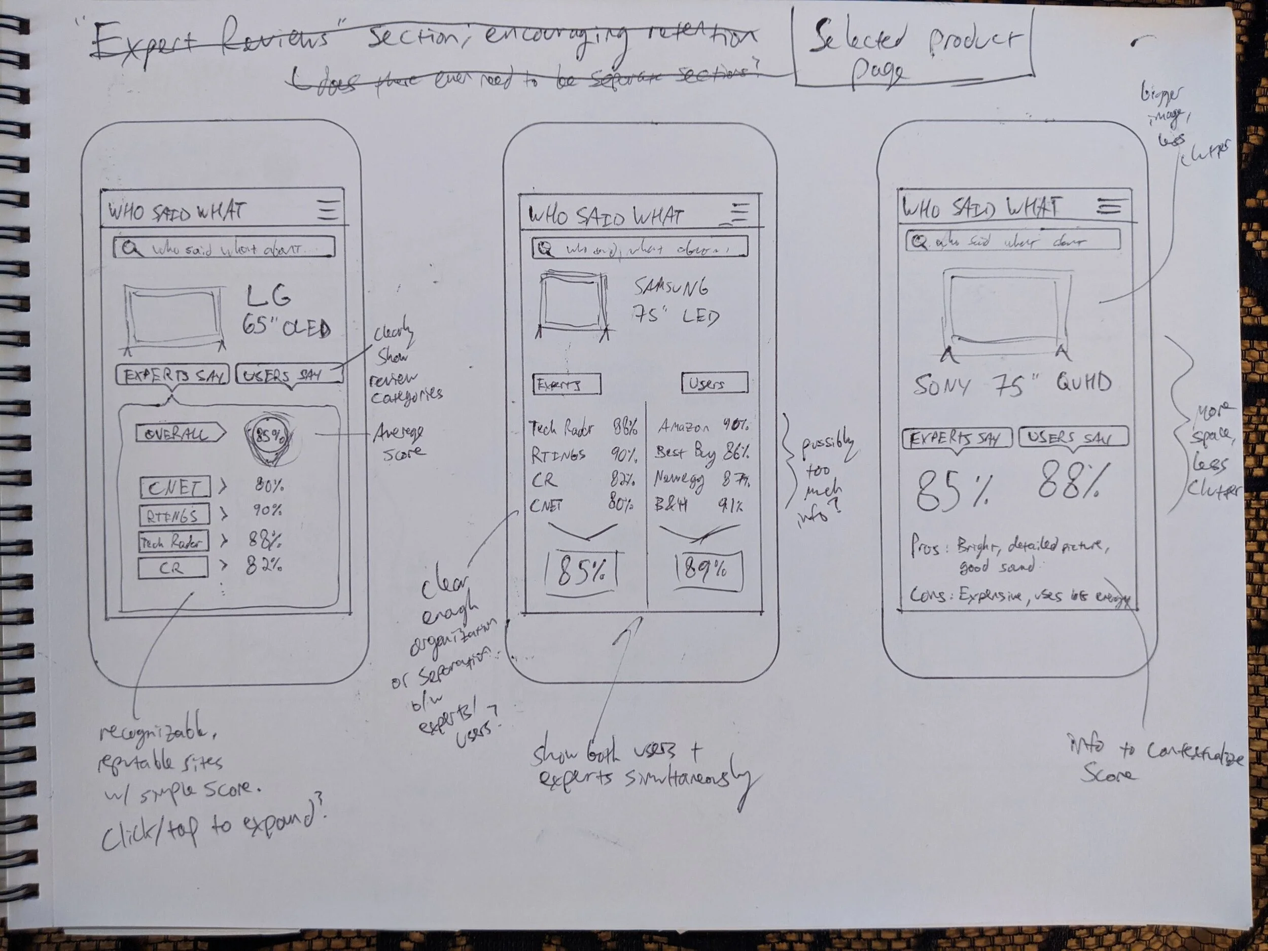
These sketches show various ideas for a selected product page.
From there, I started working in Adobe XD to get wireframes into place, with a focus on making sure that the information on the page was organized logically and wouldn’t overwhelm users.

Prototyping and user testing
I refined my wireframes until I had a medium-fidelity prototype created, with the purpose of putting it in front of some people to see what they made of it. I created a research plan to help guide me through the process and make sure I came away from the testing with some useful and actionable information.
The study goal was to explore the strengths and weaknesses of the app’s structure and presentation of information. I crafted the following research questions I hoped to have answered:
Can people identify the purpose of Who Said What upon launching the app?
Are people able to find reviews on a product they’re interested in?
Are people to then find reviews on another product they may be interested in without getting lost?
Are users able to parse the presentation of review content on hub and product pages of the app?
What additional information, if any, do users want or need when considering a major purchase?
Using a combination of in-person and virtual observation using video conferencing software, I conducted usability tests with three participants. These sessions were invaluable not only in terms of getting some takeaways for how to improve the app, but simply as a learning experience for me, as the facilitator of the sessions.
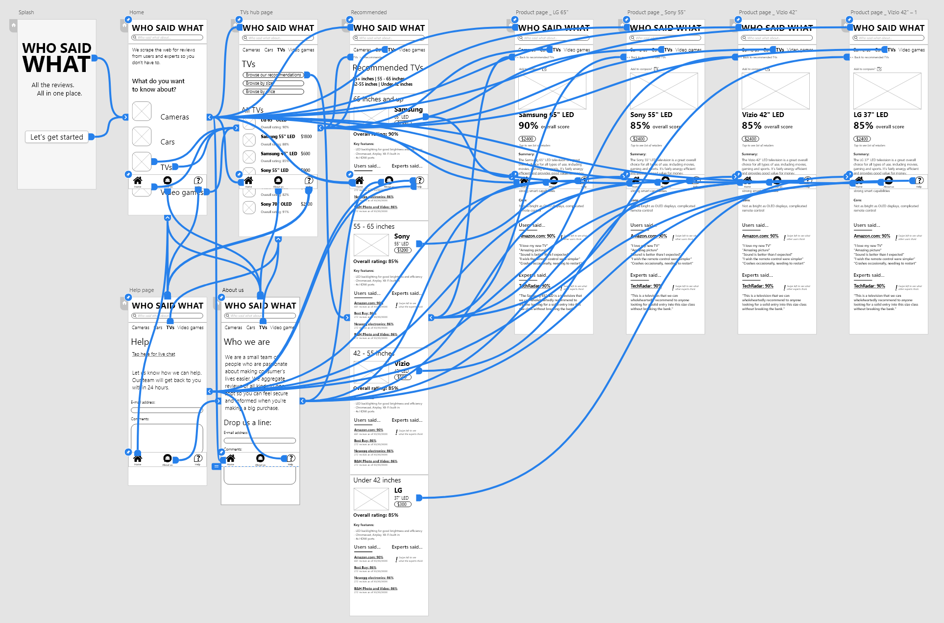
Shown here is the navigation flow on my medium fidelity prototype.
In the future, I’d like to do usability studies of a mobile app on an actual mobile device instead of people’s laptops; some conventions can be confusing when people are navigating a touch interface with a mouse instead of their finger. I also found that the search bar was something everyone valued, but as it’s nigh impossible to prototype, users were a little put-off by not being able to use it. On the positive side, all users were able to ascertain the purpose of the app as well as navigate within the bounds of the prototype without issue.
Final thoughts
I will be planning to look more at UI design conventions to create a more polished, high-fidelity prototype to build on the medium-fidelity prototype created for this class and case study. Overall, I’m pleased with the idea and how it came together. I honestly think that such a product as Who Said What would be useful for a variety of users, though I’m not naïve enough to pretend that the back-end work of creating what is essentially a web crawler / search engine for review content will be easy.
In all, though, I can see this concept having the backing of consumer watchdog and advocacy groups as well as even manufacturers themselves. It’s an opportunity to build trust with the greater consumer public, and therefore a means to strengthen brand identity and inspire greater customer loyalty.